
Gallery Walls
Gallery Wall Ideas Using Three-Photo Travel Print Sets
Learn to arrange a three-photo gallery wall with a consistent rhythm, useful spacing, and travel photography sets from the BLJ Media collection.
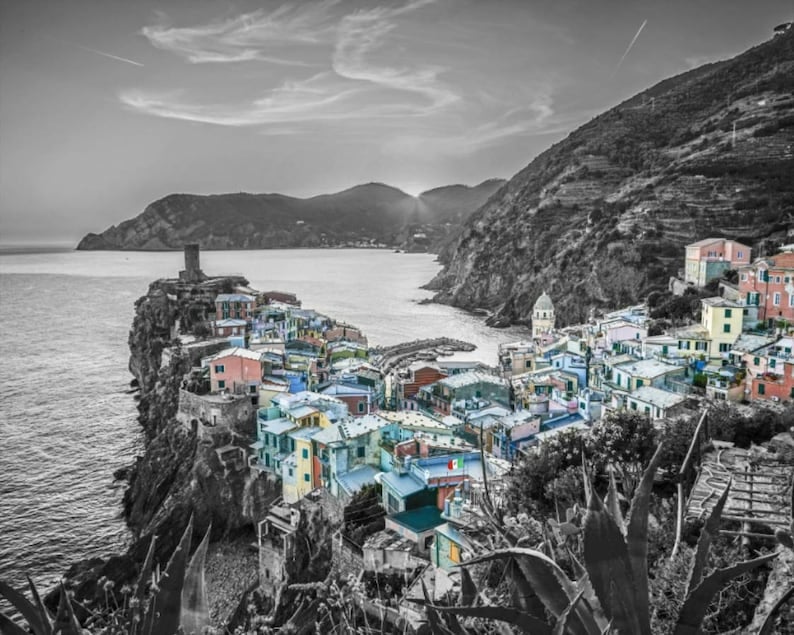
Artwork: BLJ Media original photography · Explore this Photo Print ↗
A gallery wall does not need a dozen different frames to feel intentional. Three photographs can be enough to create a clear visual story, especially when the images already belong to the same collection. The challenge is less about filling every inch of space and more about giving each photograph a role. With BLJ Media’s existing three-photo travel collections, you can begin with a shared subject or place and focus on how the prints relate to one another. These steps help you plan the layout before anything goes on the wall.
Treat the set as one composition
A three-photo collection is most useful when you judge it as a whole rather than as three independent purchases. Look at the rhythm across the images: Does one have a strong focal point? Are some frames busier or quieter? Do the photographs naturally invite the eye to move from left to right? The answers will influence the order you choose.
The Cinque Terre set provides a place-based starting point, while the Panama and Hawaiian Beach sets offer different travel themes. Examine the actual images in each product gallery and choose the set with the visual relationship you want to live with. A consistent subject is a useful beginning, but the sequence is what makes the group feel curated.
Plan the sequence before the spacing
Lay three printed thumbnails on a table and try several orders. Move the busiest image to the center, then to an end. See whether a change in direction makes the composition feel more balanced or more dynamic. There is no universal requirement to put the most dramatic photograph in the middle; what matters is how the individual images work together.
Once you have an arrangement that feels right, photograph your test layout so you can compare it later. Trying more than one sequence is a simple way to avoid deciding too quickly. It also helps you notice repeated lines, shapes and color relationships that may be hard to see while looking at each picture separately.
Keep the display coherent
A row of three works especially well when the images share similar dimensions and framing. An intentional equal gap gives the series a consistent rhythm. If you prefer a more informal arrangement, try positioning the photographs in a compact cluster while still making the spacing feel deliberate. The goal is visual connection, not a fixed measurement handed down as a decorating rule.
Use paper templates cut to the finished frame size, not just the unframed photograph size. This allows you to test the overall group on the actual wall. Step back from the everyday viewing distance. If the group feels fragmented, bring it together; if it feels crowded, create more breathing room. The final position should serve the room's proportions.
Make crop and orientation part of the decision
Three related photographs are not necessarily identical in orientation. Before buying, review whether each source image has the proportions needed for the display you imagine. A tight crop can remove details that made one image an important part of the set. Always judge a final-size preview rather than assuming a format will fit naturally.
If you want the photographs to read as a unified collection, consider repeating the same external frame dimensions. That may mean giving some images more border area when their aspect ratios differ. Consistent outer dimensions can be visually useful, but preserving a meaningful part of the original photograph should take priority over rigid uniformity.
Pick the wall before the final arrangement
A hallway, dining space and sofa wall each create a different viewing experience. A hallway encourages closer, sequential looking, while a larger room often presents the three photographs as one group from a distance. Walk through the room and identify the moment when the images will be most visible. This is a better guide than planning from a blank floor plan alone.
Lighting matters to the experience too. Look at the actual conditions throughout a normal day and check for strong reflections near windows or fixtures. The finish and framing decisions can follow from how you expect to view the artwork. Treat the photographs as part of the room's daily use, not simply an arrangement that looks good for a single snapshot.
Bring the idea into your space
A coherent three-photo wall begins with photographs that belong together and an arrangement that makes their relationship legible. Pick a travel subject you enjoy, test the left-to-right order, use full-size paper templates, and confirm that the available print proportions preserve the images you want to show. Explore the BLJ Media Cinque Terre, Panama and Hawaiian Beach collections for examples of three-photo travel art; check each product page for the current purchase options before planning around a particular size.
Sources and artwork references
This guide draws on the identified BLJ Media product descriptions and photographs below. Styling suggestions are editorial guidance, not claims of product testing or a guarantee of particular results.
Editorial note: This launch guide was prepared with AI assistance using BLJ Media’s existing catalog. It is not a first-person account of the photographer.