
Buying Art
How to Choose Travel Photography Prints for Your Living Room
A practical guide to finding travel photo prints that suit your space, from choosing a meaningful subject to planning the crop, scale, and placement.
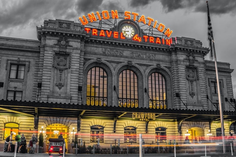
Artwork: BLJ Media original photography · Explore this Photo Print ↗
Choosing a photograph for your living room is easier when you stop treating the artwork as one more decoration and start thinking about what you want the room to feel like. A travel photograph can suggest a favorite destination, reveal an architectural detail, or draw your attention to a landscape you would love to see again. The best starting point is not the frame or the price; it is the image itself. Here is a practical way to decide between very different BLJ Media Photo Prints while leaving room for your own taste.
Start with a place or subject that means something to you
A recognizable scene has a different appeal from a photograph chosen purely for its shapes and tones. BLJ Media’s Denver Union Station photograph offers an architectural subject tied to a particular city, while the Banff photograph offers a landscape direction. Neither choice is inherently better. The question is whether you want the artwork to spark a memory, invite conversation, or simply create a particular atmosphere.
Try writing down two or three words that describe the experience you want: energetic, restful, curious, familiar, expansive. Then compare photographs without thinking about the wall for a moment. The picture that keeps drawing your attention is worth studying more closely. A great match to the furniture will feel less satisfying if the scene itself never holds your interest.
Decide whether architecture or landscape fits the room
Architecture photographs often contain repeated lines, edges and human-made geometry. In a living room with restrained furnishings, a piece such as the New York Flatiron print can act as an intentional point of visual structure. Look at the direction of the major lines and imagine how they work with nearby bookcases, windows, or a fireplace.
Landscape photography invites a different reading. Rather than checking whether a building's edges align with furniture, consider the horizon, open areas, and the proportions of land and sky. A Banff photograph can help you test this approach. The important choice is how the composition occupies the wall, not a rule that every landscape must sit in a certain kind of room.
Think about the photograph at the size you will actually see
An image that works beautifully as a small screen thumbnail may feel different once displayed across a larger wall. Before choosing any Photo Print, make a paper template in the intended dimensions and tape it to the wall. Stand where you normally sit. Is the artwork large enough to read, or does it disappear in the space around it?
Then consider the crop. A photograph's original proportions will not necessarily match every available print size. If you move from a broad composition to a more square one, parts of the original image may need to be removed or borders added. Check the preview rather than assuming every size presents the complete scene in exactly the same way.
Let the photograph guide your color decisions
You do not have to match a photograph exactly to your upholstery, paint or rug. Instead, look for a connection between a few colors already present in the room and tones that appear in the picture. This can be subtle. It may be enough for the artwork to bring a needed contrast rather than repeat everything you already own.
The Lisbon Tram and Denver Union Station photographs offer different kinds of subject matter, making them useful comparison points while browsing. Review the actual image at a generous display size and consider whether its overall warmth, coolness, or contrast feels deliberate beside your room's existing materials. The artwork should feel selected, not forced into a color formula.
Choose where the viewer will encounter the print
A photograph above a sofa is usually seen from a different distance and angle from a print on a narrow wall near an entry. Consider the normal viewing position before you select a crop and frame. For a close-viewed photograph, the details and small choices inside the scene may matter more than they do for a picture seen from across an open room.
Avoid treating every empty wall as needing another picture. One piece with an intentional amount of surrounding space can feel more confident than several competing subjects. You can always build a larger group later, after you know which photograph forms the heart of the display.
Bring the idea into your space
When you are ready to shop, narrow your choices to two or three photographs and look at them as potential objects in your real room, not just as online product images. Compare the composition, make a size template, check how the crop behaves, and ask which scene you will still enjoy seeing every day. Browse the linked BLJ Media Photo Prints to compare the actual subjects; confirm available sizes, finishes and checkout status on each product page before ordering.
Sources and artwork references
This guide draws on the identified BLJ Media product descriptions and photographs below. Styling suggestions are editorial guidance, not claims of product testing or a guarantee of particular results.
Editorial note: This launch guide was prepared with AI assistance using BLJ Media’s existing catalog. It is not a first-person account of the photographer.